One Level
Less
Studio had two levels that rendered the same page, and one tile shape standing in for everything on it. Nobody could hold a picture of the product in their head without a person there to explain it. The fix wasn't a feature. I took a level out.
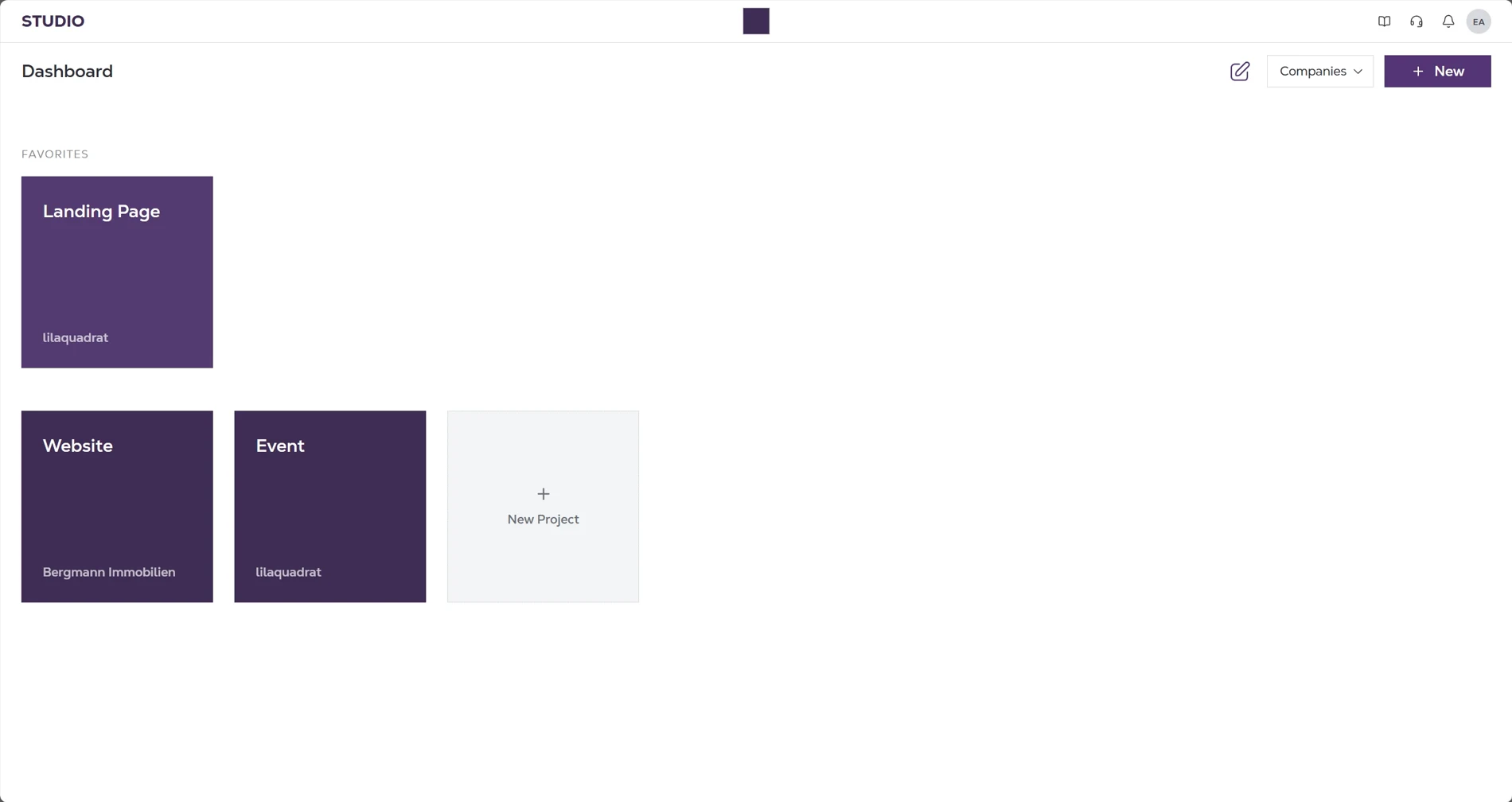
Three levels became one.
The last click re-opens the app you never left.
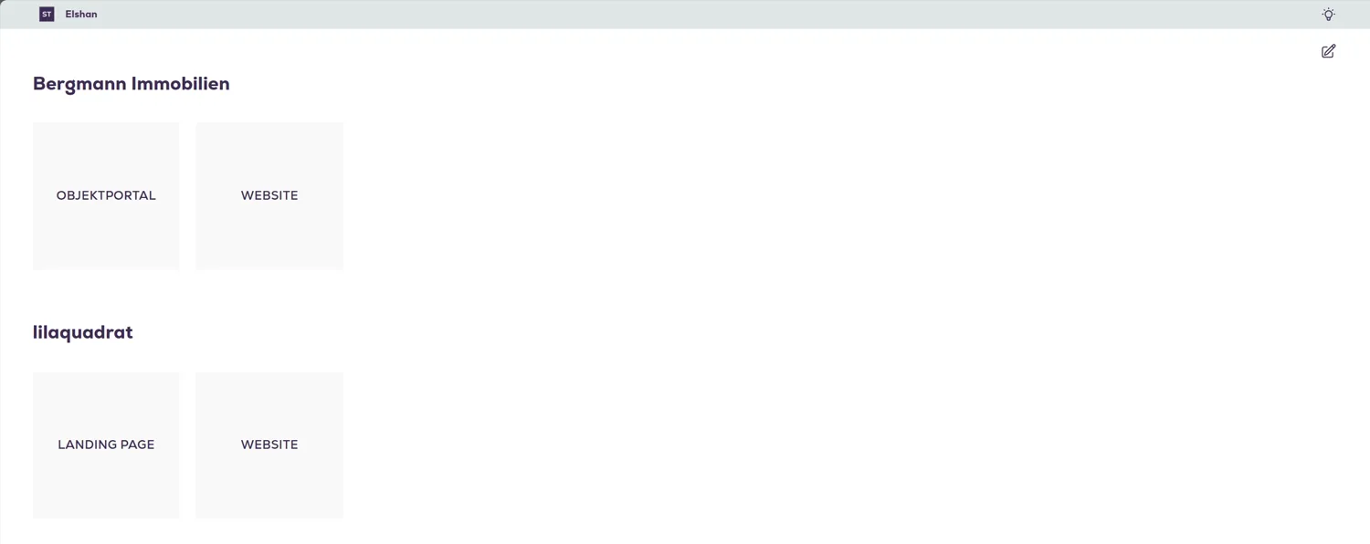
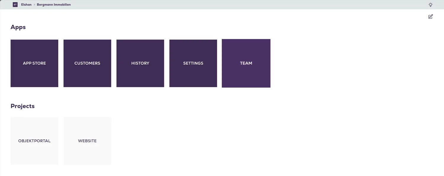
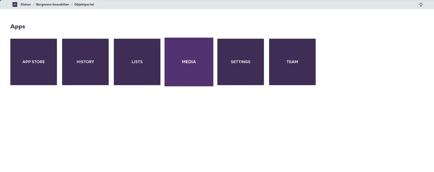
You are in one company's Customers. You need the same app in another company's project. There is no way across, only up and back down. Customers → project → company → root → the other company → its project → Customers again.
One shape stood in for three different things.
A tile was a company. A tile was a project. A tile was an app. Same size, same colour, uppercase label, no icon, no metadata. And two of the levels answered with a grid headed the same word. The breadcrumb was the only thing on screen that knew where you were, and it was the only thing.
No research budget, no feature authority, live customers.
Sole designer. Live throughout, with no migration window to hide behind. The feature set wasn't mine to change. So I didn't touch what Studio could do. I changed where its things live.
The problem was never what Studio could do. It was that its structure was invisible.
Context survives the switch.
Projects came to the front, because a project is what people actually work in; company became a label on the card and a filter in the header. Apps stopped being a destination: one overlay holds this project's apps and every project, switchable in place. Customers, then another project's Customers, its App Store, its Team, its Media: every jump is one overlay, never a trip back to the dashboard. Switch project and you stay on the screen you were on.
Two kinds of navigation, one panel.
An app like Editor has its own navigation, the pages you're working on, and still needs the project's. So the switcher went, and the panel carries both: the app's pages up front, the project's apps folded behind one bar that names where you are. Open it and the pages slide aside to show everything this project has; close it and you're back on the same list. No second menu, no page change, nothing to lose your place in.
The same model, applied across the product.
Detail views became structured records instead of rows. Team gained a real permission model where a tile used to sit with nothing behind it. And where a level genuinely matters, it is now named in words rather than inferred from which tiles are missing.
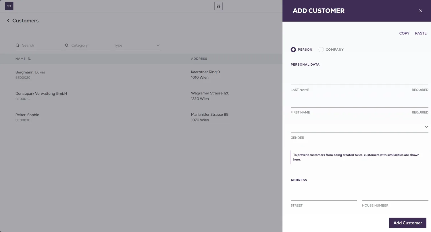
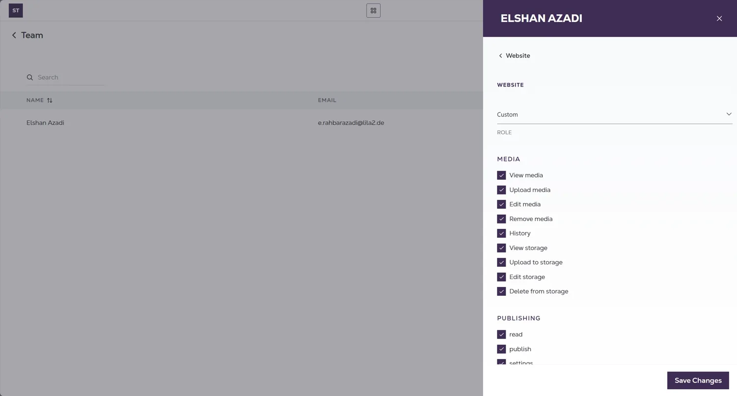
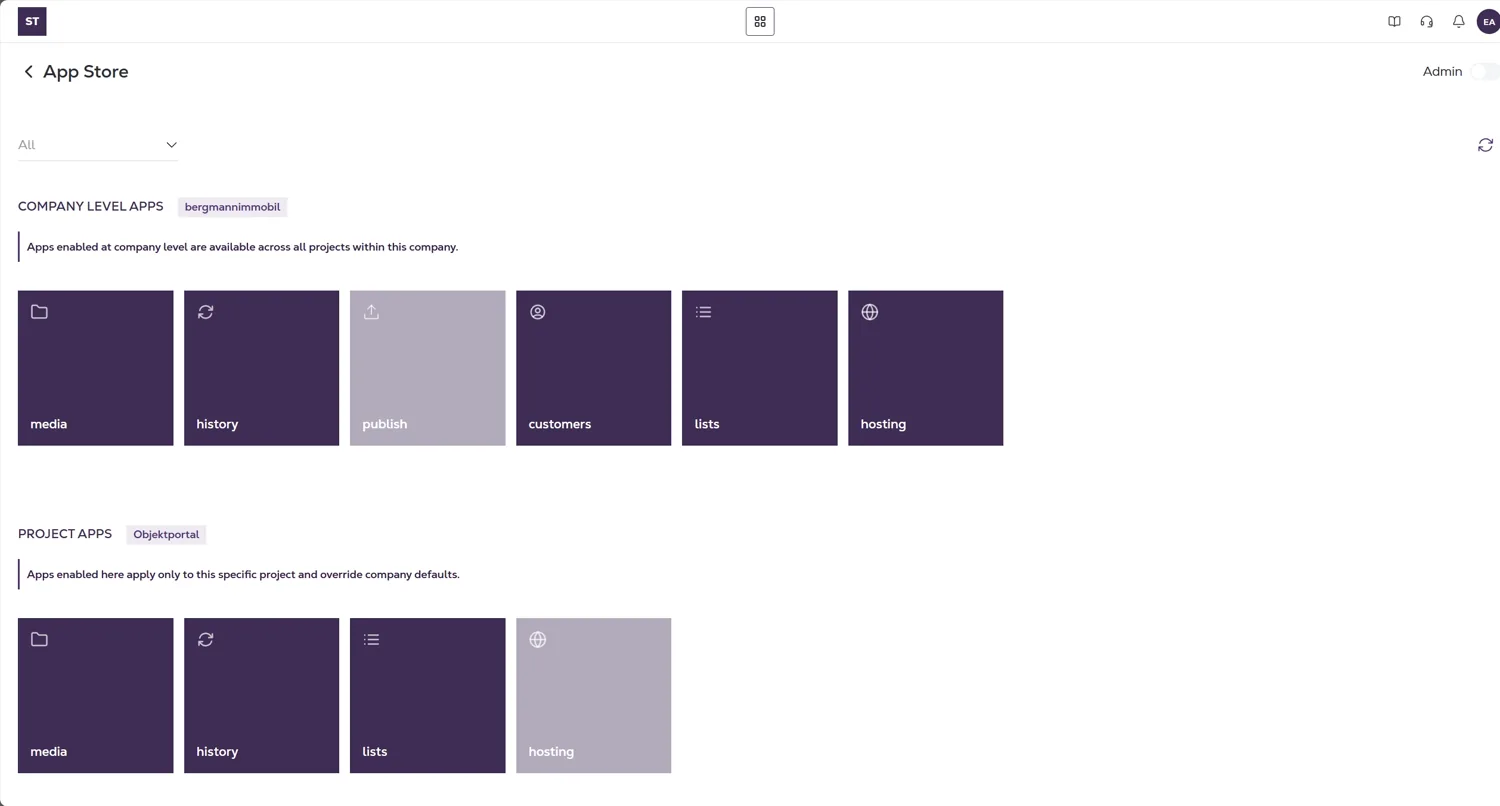
Fix the map, and every screen follows.
The old Studio was organised the way it was built: companies, then apps, then whatever project you happened to be in. The new one is organised the way people work. A project holds the work, its apps live inside it, and you can always see which one you're in and jump to the next without going back up. Once that order was right, each screen was a matter of applying it, which is why the structure came before the polish.
Time to a first published item. How often support is asked where to find something. And whether people move between apps from the panel, or still route through the dashboard.