Navigation redesign·2026·lilaquadrat

Studio, rebuilt

Studio is where lilaquadrat's customers run their websites, shops and events. A company owns projects, and every project has its own apps. In use, people got lost: every level looked the same, and reaching the same app in another project took seven clicks. As the only designer, I rebuilt the structure, the interaction and the front end while customers kept working in it.

Role
Product designer, sole design owner
Year
2026
Owned
IA, interaction, visual system, front end
Context
Live customers throughout, no downtime

Problem

Every level looked the same, so nobody knew where they were

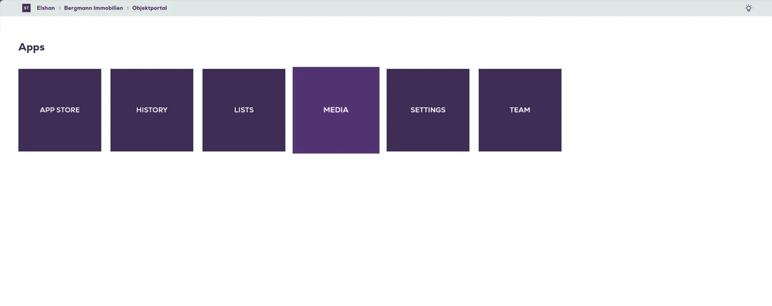
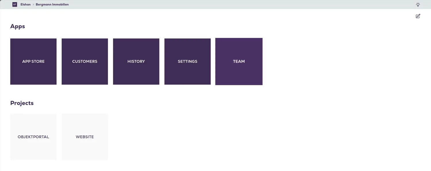
Company, project and app were all the same tile. The company page and the project page both showed a grid called Apps, and only the breadcrumb, in small type at the very top, told you which level you were on.
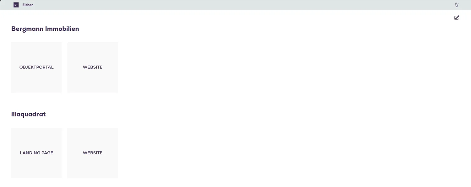
Old Studio, all companies: each company as a heading with plain tiles for its projects.
Old Studio, a company page: a grid headed Apps, and a grid headed Projects under it.“Apps”
Old Studio, a project page inside that company: another grid headed Apps.also “Apps”

Before

Seven clicks to reach the same app in another project

From one project's Customers to another's: up to the project, the company, the list of every company, then down into the other company, its project, and Customers again. The last click reopens the app you were already in.

Solution

Seven clicks became three by removing a level

People work inside a project, not inside a company. So the dashboard lists projects directly, and the company became a label on each card and a filter in the header.

Before
  1. Level 1All companies
  2. Level 2Company · apps + projects
  3. Level 3Project · apps
  4. The appCustomers
After
  1. Level 1ProjectsCompany is a label and a filter
  2. The appCustomersSwitch project here, no page change
Clicks7 → 3
Levels climbed3 → 0
App re-selected1 → 0

Solution

One panel, reachable from every screen

A bar at the top of every screen opens one panel: this project's apps, its pages, and every other project. Pick another project and you stay on the screen you were on.

The two decisions only work together. Without the panel, one level fewer is still a climb. Without removing the level, the panel is a shortcut through a maze that's still there.

Redesigned

Switch project, stay on Customers

The same task as before: from the dashboard into one project's Customers, across to another project's Customers, then on to Team and the App Store, all from the one panel.

Redesigned

The dashboard lists projects, and the company is a label

Favourites on top, every other project below. No company page to pass through on the way in.
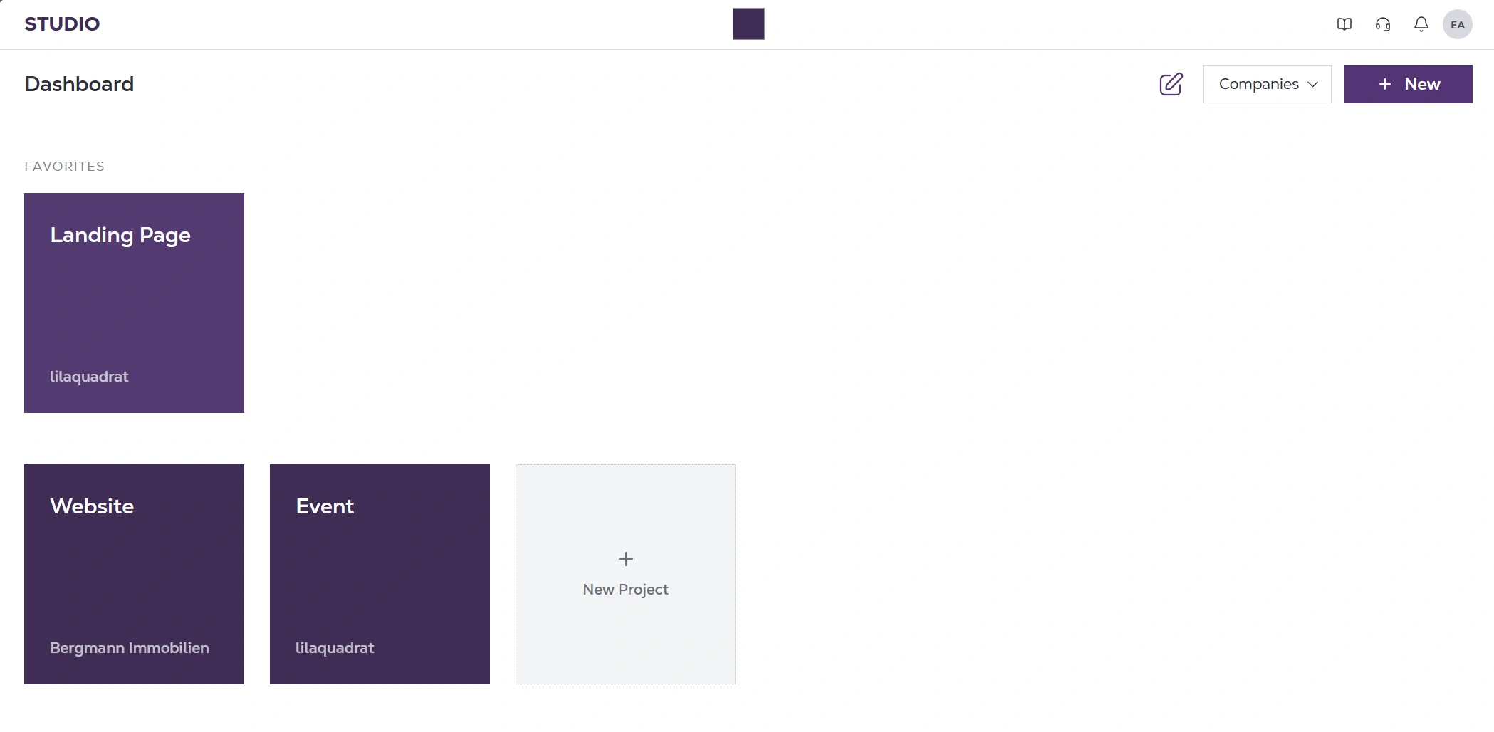
The new dashboard: a favourite project on top, the other projects below, each card labelled with its company.

Redesigned

The same rules, everywhere else

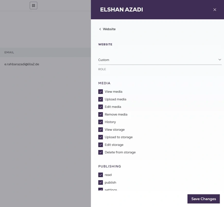
A record opens in a side panel instead of on a new page, and permissions are set per app.
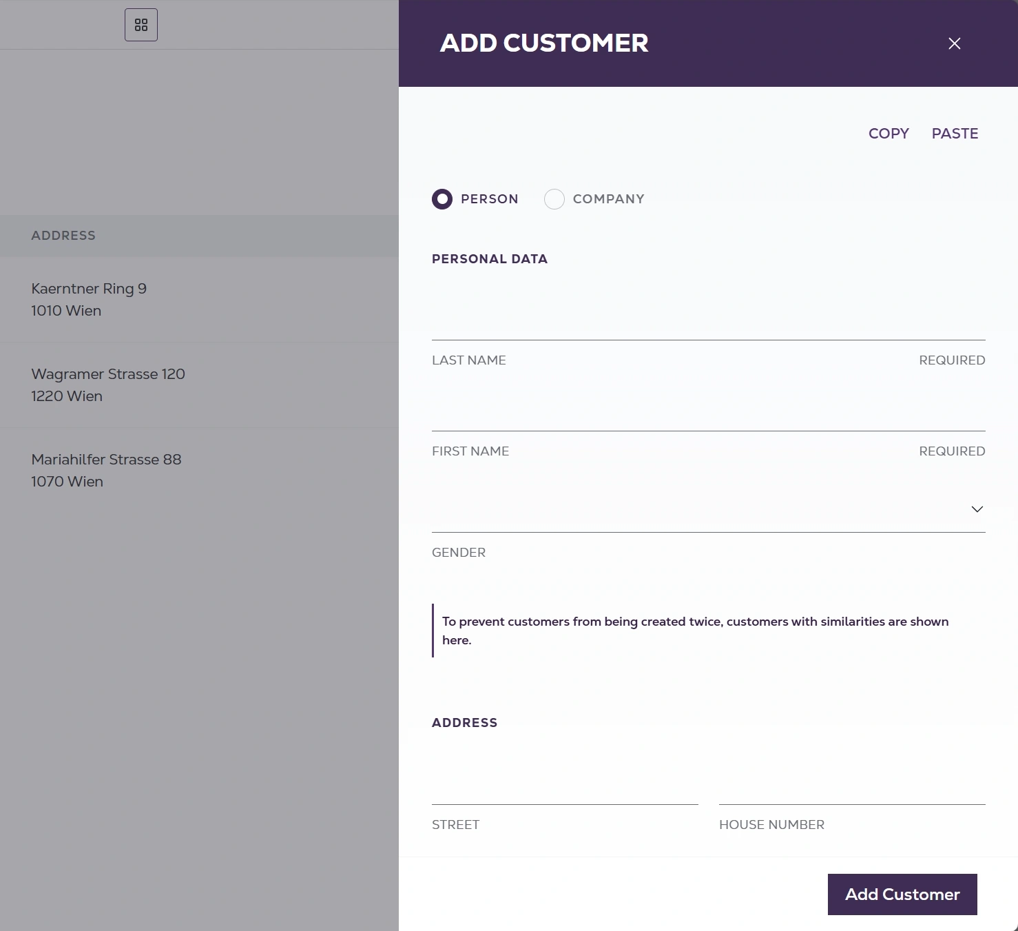
A new customer opening in a side panel over the Customers list: person or company, personal data, a duplicate warning and address fields.
A team member's panel with permissions per app, grouped under Media and Publishing.

Redesigned

The App Store keeps company apps and project apps apart
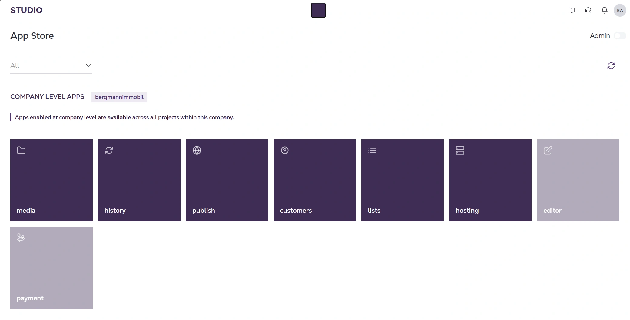
The App Store split into company-level apps, available in every project, and project apps, which override the company's defaults.

Result

Seven clicks became three, and three levels became one

Counted from matched recordings of the same task in the old and new versions. The rebuild went out to live customers with no downtime.

What I'd measure next: time to publish a first item, how often support gets asked where something is, and whether people switch from the panel or still go back to the dashboard.