Platform redesign·2026·UX/UI

Not a Form

Heritage journeys, youth camps across 36 countries, talent programmes. The portal that took the applications read like paperwork, so the redesign makes it read like the start of the trip.

Role
UX/UI design, sole designer
Domain
Community platform, applications
Built with
Figma
Type
Platform redesign

Problem

Nothing told you where you were going

No photography, no progression, no hierarchy, and all four programmes looked identical. Every fault produced the same feeling: an administrative task.
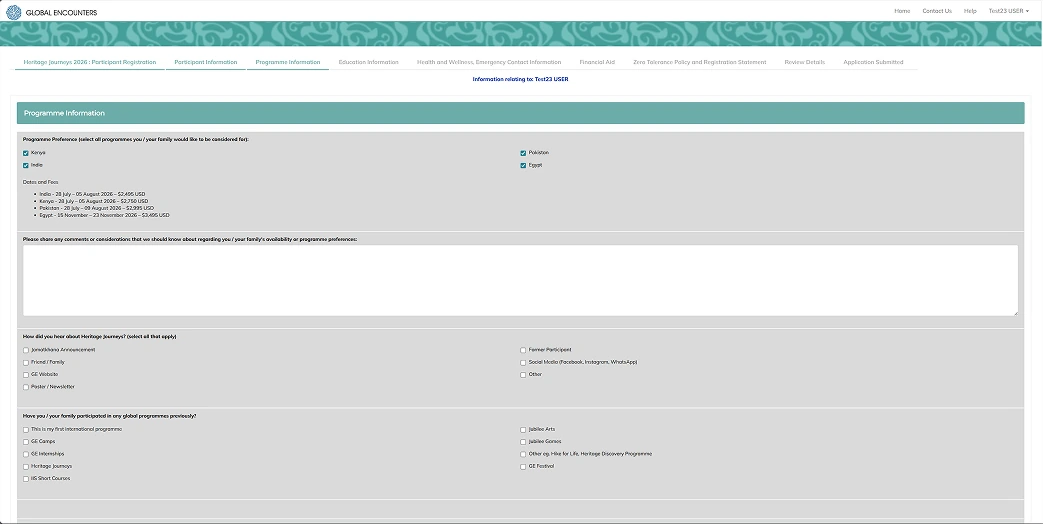
The old application form at step three: eight tabs across the top, teal chrome, and grey fields.

Before

A faded map and five identical cards

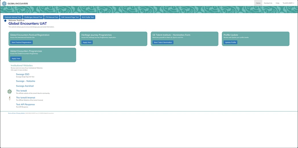
Logging in took two screens over a washed-out world map. The dashboard gave five teal cards the same weight, with a half-finished application buried somewhere behind them.
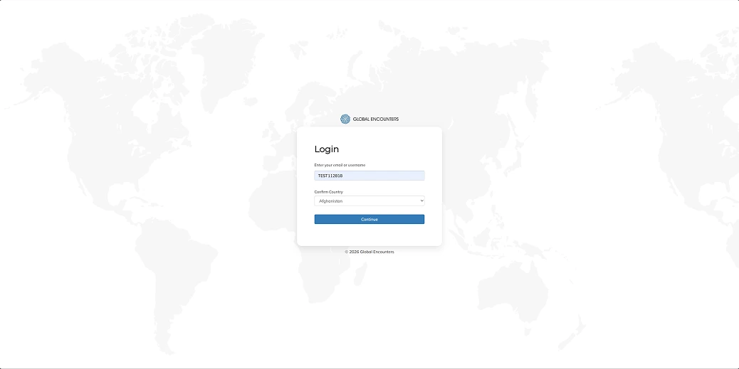
The old login: a small box over a faded world map.
The old dashboard: five teal cards of equal weight and a list of links below.

Before

All eight steps before a single field

The form opened on every one of its steps at once, as a row of tabs. No progress, no sense of how far there was to go.
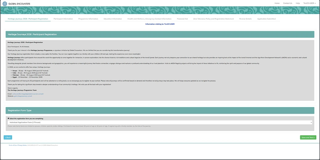
The old form's first screen: eight step tabs across the top and a long block of grey text.

Solution

It should feel like the beginning of a journey, not like filing a form

Every decision that follows comes out of that one line. The flow became six screens, each asking one question.

  1. LoginWhere am I going?
  2. DashboardWhich programme?
  3. SelectionWhich one exactly?
  4. ApplicantWho is this for?
  5. Step oneWhat's on offer?
  6. Step twoWhat do you prefer?

Redesigned

The first screen says where you're going

Email and password collapse onto one screen, over a full-bleed photograph of the Amber Fort. Before anyone types a character, they know what this is for.
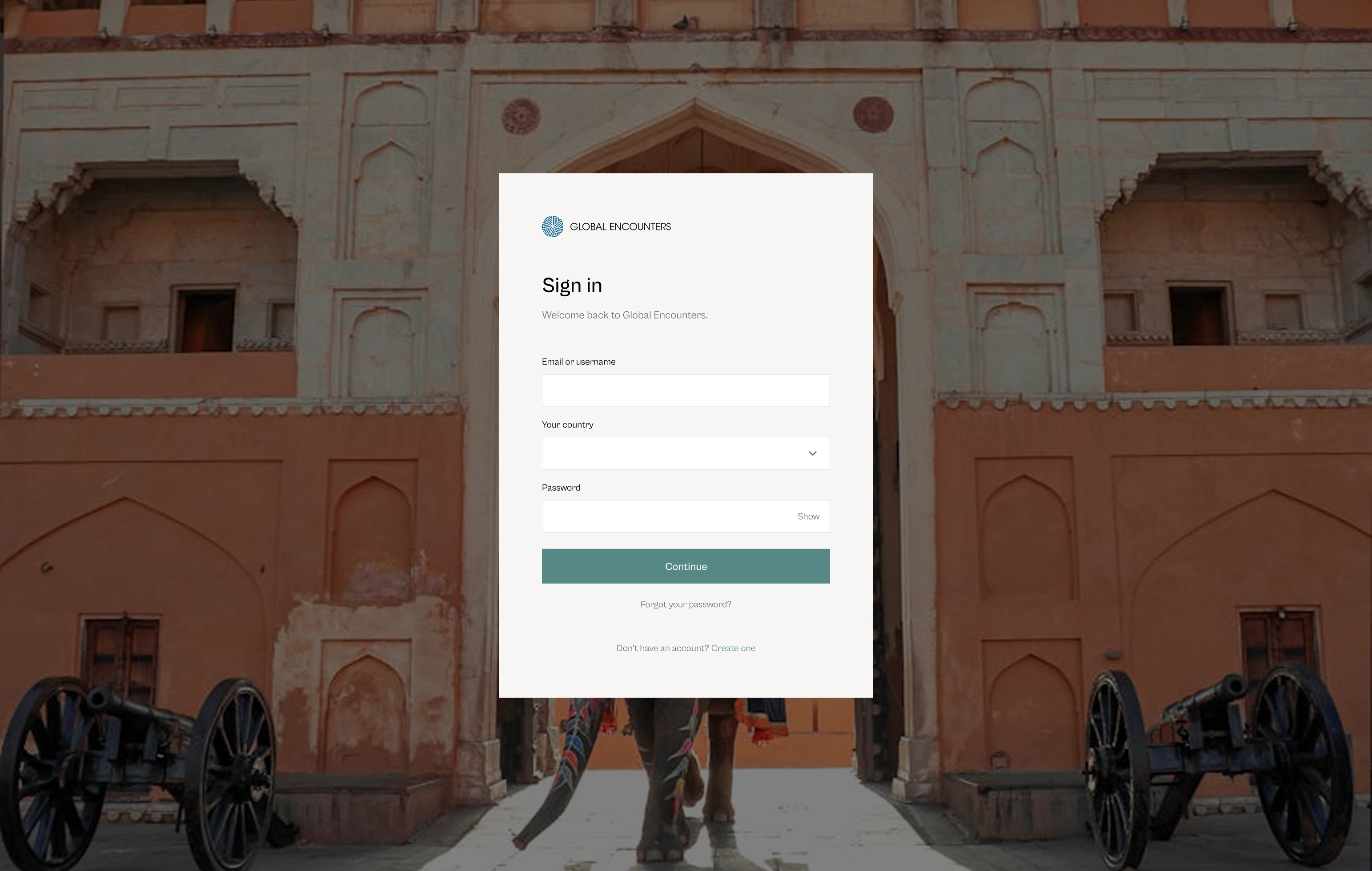
The new login: one sign-in card over a full-bleed photograph of the Amber Fort.

Redesigned

Two cards worth dwelling on

A personal greeting, then two hero programmes with destination photography and an apply button. Everything secondary drops to a text link: photography means dwell, text means utility.
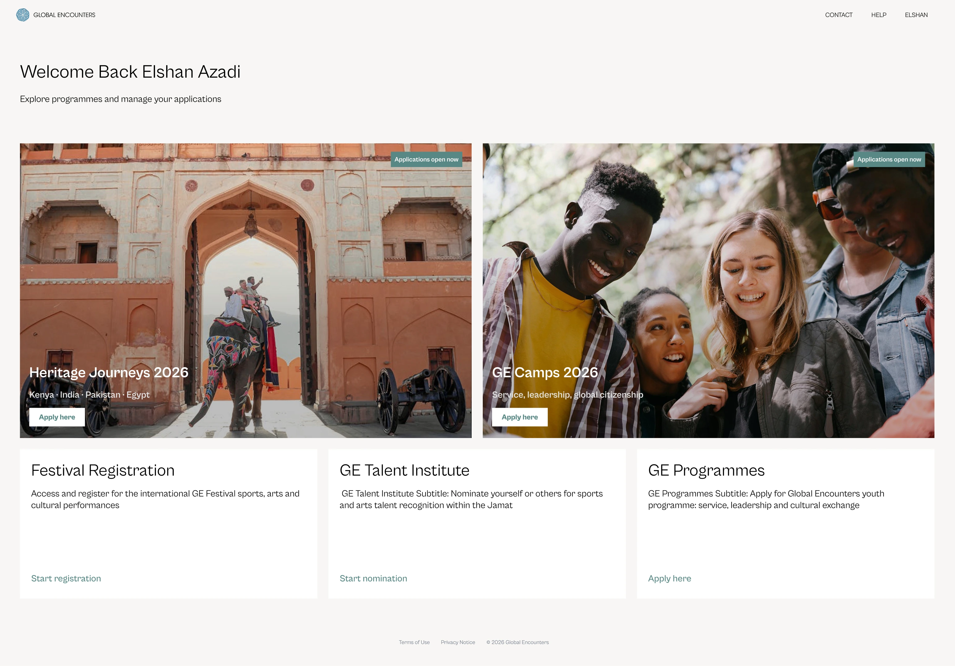
The new dashboard: a greeting, two large photographic programme cards, and three text-led programmes below.

Redesigned

Who is this application for?

People often apply for a family member, so the form asks first. Two cards, one already carrying an in-progress badge, and Continue stays inactive until one is picked.
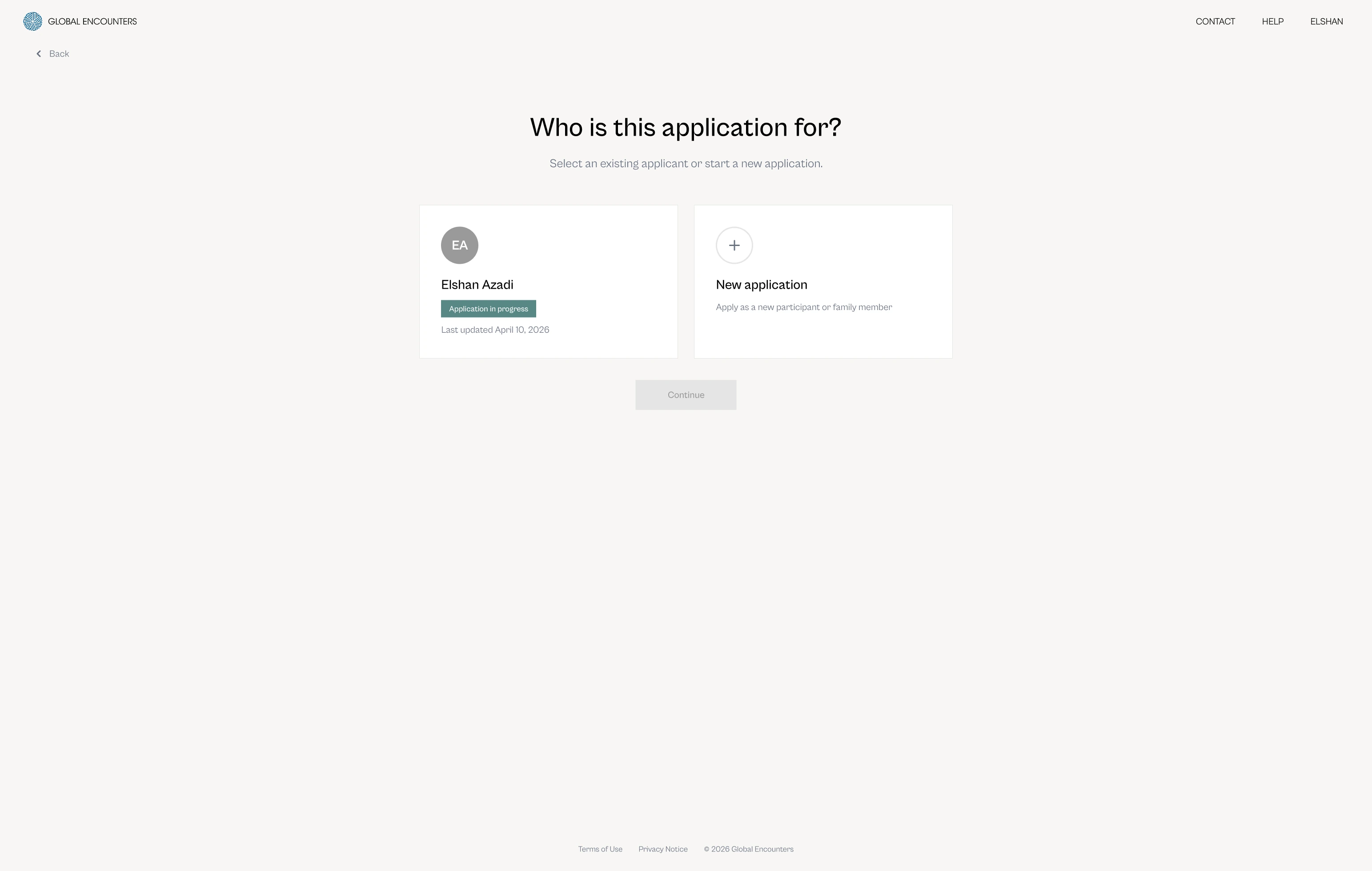
Applicant selection: an existing applicant with an in-progress badge, a new-application card, and a disabled Continue button.

Redesigned

Eight tabs became one step

Step one opens with a welcome, every destination with its dates and price, and a progress bar that's there before the first field.
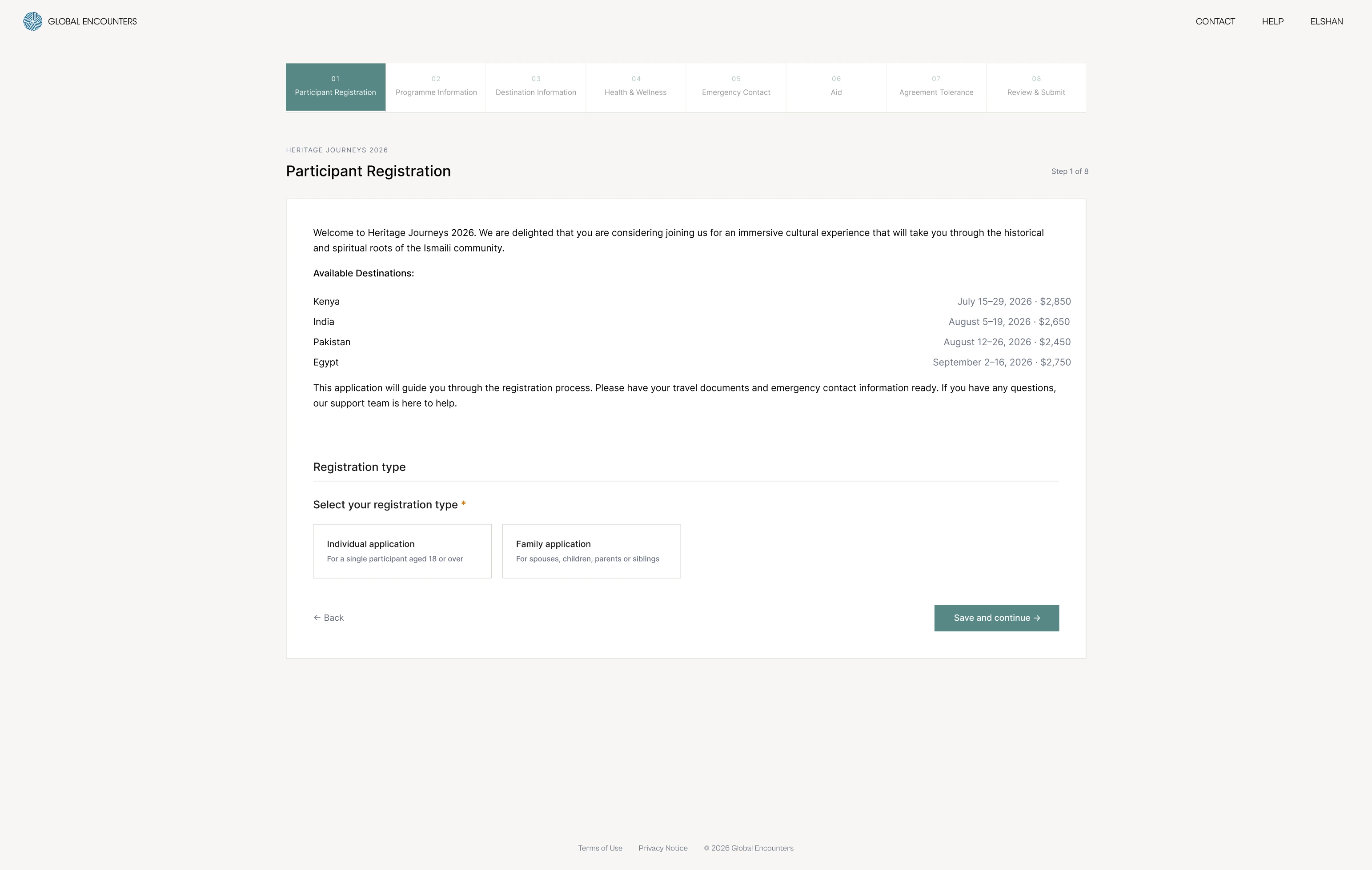
The new step one: a progress bar across the top, a welcome, the destinations with dates and prices, and the registration type.

Result

Six decisions, carried through the whole platform

Set in the first milestone and carried unchanged through the rest.

  1. Cabinet GroteskGeometric, with warmth, in place of a generic extra-light sans.
  2. A colour per programmeEach keeps its own accent. Teal is reserved for anything interactive.
  3. Photography as contextUsed where dwelling is right, withheld where speed is.
  4. No rounded cornersSharp edges: editorial rather than generic SaaS.
  5. Cream, not white#F8F7F5 for the page; white for containers and cards.
  6. One decision per screenProgressive disclosure instead of everything at once.